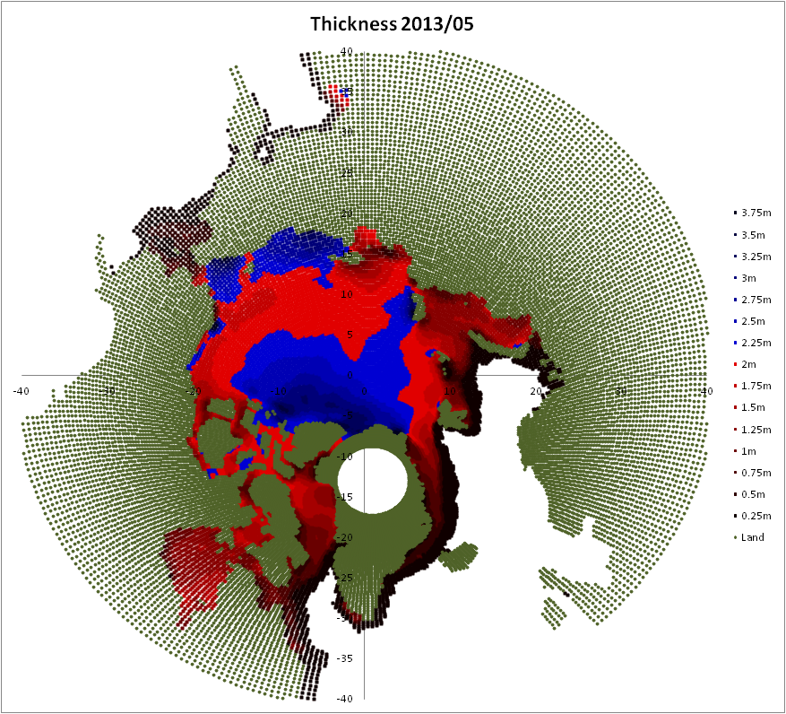
Here is the gridded thickness field for May 2013, click to enlarge.
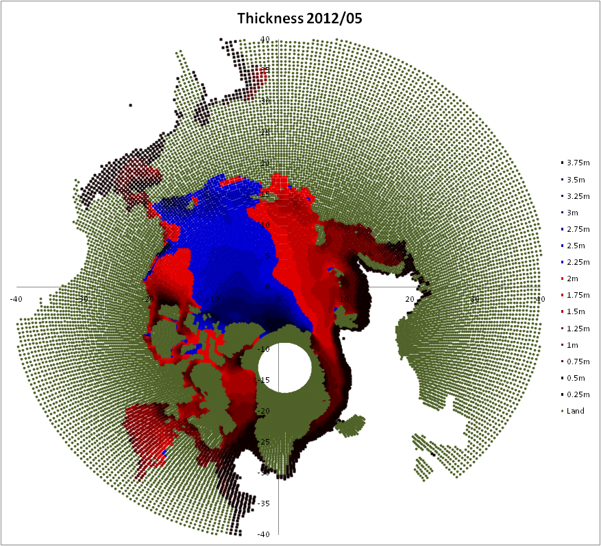
To compare, here's May 2012.
But I've also done a difference plot, note that while the above plots are in increments of 25cm, this plot is in increments of 10cm.
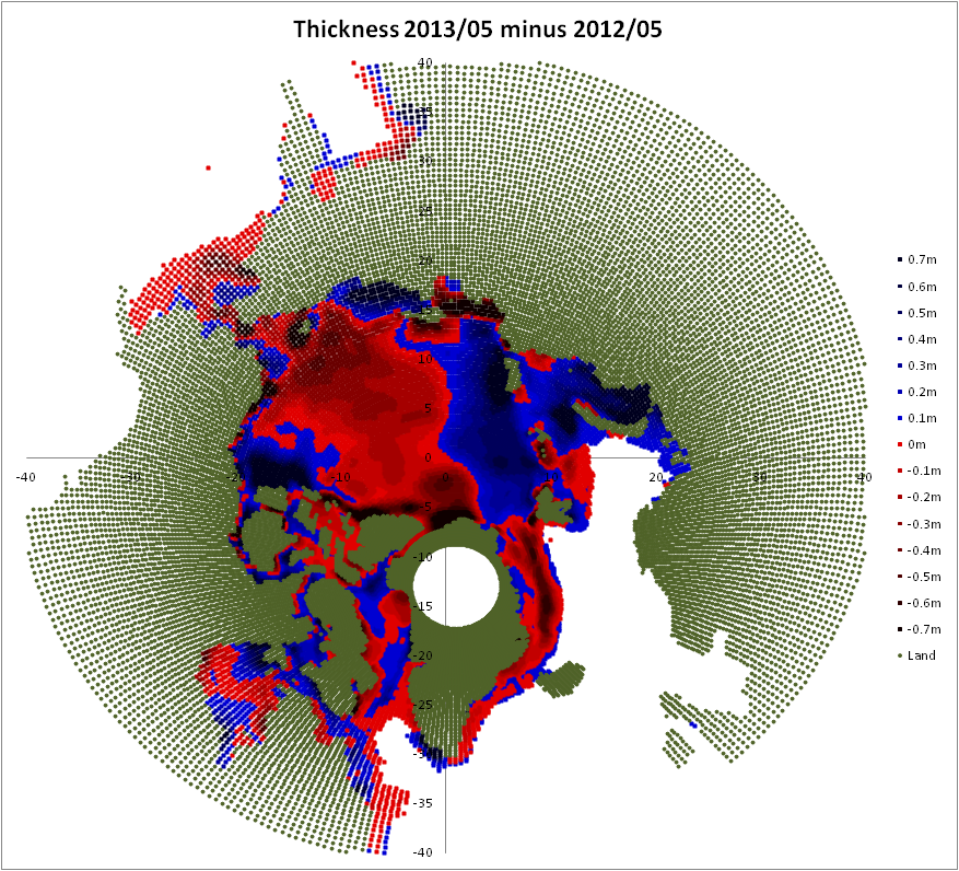
In the Atlantic sector the ice is thicker in 2013, which is to be expected following last year's state in Barents, the ice is also thicker this year in Beaufort which again is to be expected given the early opening of Beaufort last year. However the ice is significantly thinner across a broad swath of the pack.
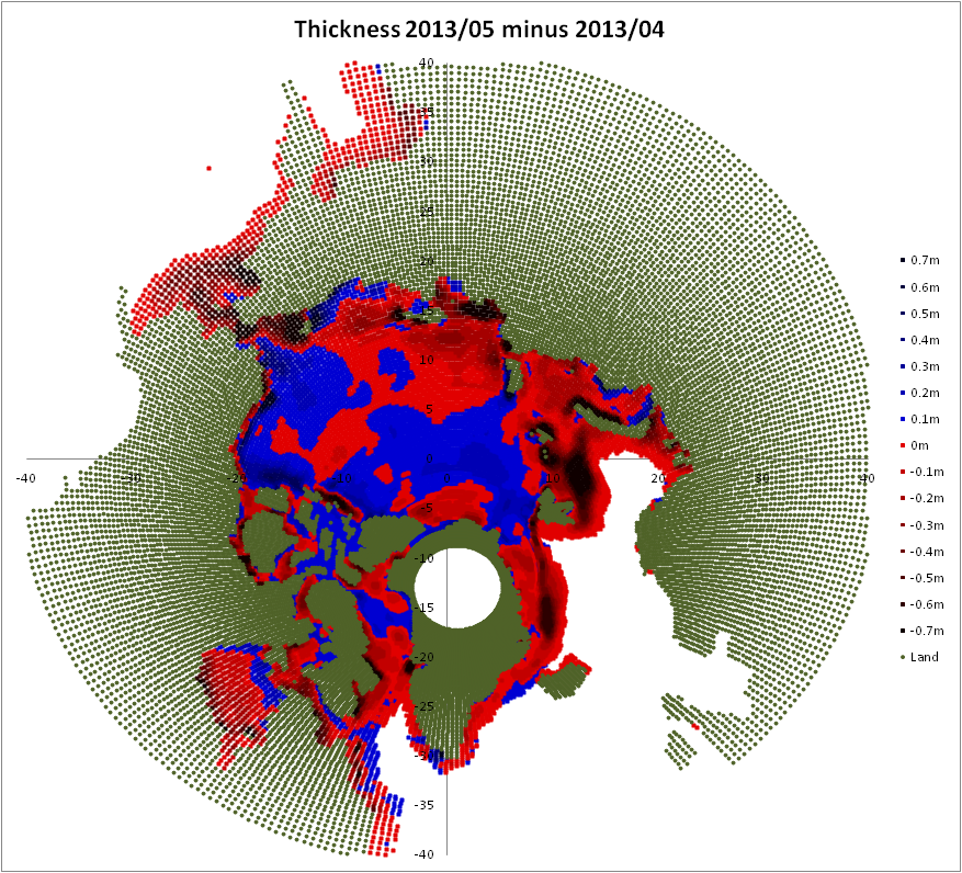
The difference between April and May shows that despite the slow start the melt season is underway, with a broad pattern of thinning across the pack, and minimal thickening.
This thinner state is reflected in the thickness profile for 2013. Below is a plot of volume from different thickness categories, in 25cm bands of thickness, for the whole pack.

May 2013's thickness profile is virtually identical to May 2011, however this alone should not suggest an end of season volume similar to 2011, 2012 had a thicker profile, yet was a substantial new record. Volume decline, which implies thinning, is driving the long term reduction in summer area/extent, link, but weather still plays a big role in individual years.
Breaking down the volume data into regions and a 2m thickness split is an approach I use regularly. The regions can be found here, the 2m thickness seems to me to be significant because 2m is roughly the maximum thickness due to thermodynamic thickening within a single season, so it's a good proxy for first-year and multi-year ice (FYI and MYI respectively).
Here is a breakdown using regions and the 2m split, the regions: ATL = Atlantic, SIB = Siberian, AME = North American continent, ALL = All regions. The figures in the rows marked '13 - '12 are the differences between 2013 and 2012. The right-most columns are the respective total volumes for May of each year. Note my calculation of gridded volume differs slightly from the PIOMAS main series monthly average, probably due to differences in grid box area.

From this it can be seen that the overall (ALL) deficit in greater than 2m thick ice is due to SIB, because AME and ATL balance out. The gain in ice under 2m thick is largely due to SIB with a small contribution from AME. Once again the similarity between 2013 and 2011 is apparent, here in the 2m split for ALL, although the regional splits show that those years have different spatial patterns.
As I now have April volume data I have updated my projection of minimum volume for 2013, it's a method I'm not impressed with as discussed in my earlier post, but for completeness it's worth revisiting with April data. The projection method uses the relationship between April thickness and thinning through to September, as described in my post on the subject, link.
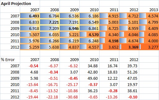
Following along rows follows the application of the thinning profiles of stated years, and the columns give the initial conditions of thickness distribution in April applied to the thinning profiles for years 2007 to 2012. Using the April initial conditions and April to September thinning we see that applying 2012's thinning profile gives a modest new record, and that the post 2010 years thinning profiles beat 2011. If I take anything from this it is that given the increasing aggressiveness of thinning profiles with each successive year, we are very likely to beat 2011, if not 2012, assuming that the late start to the melt does not make the thinning profile of 2013 atypically mild. I don't consider this method worth pursuing, but will update 2013 when September 2013's gridded thickness data is available.
One aspect of this new data is that it firmly puts into doubt any claims of a 'recovery' in 2013. 2007 pushed the sea/ocean system below its equilibrium point, so as can be seen in the regional breakdown graphic the response in the following year was a substantial rebound.
Leaving aside the ATL region, which is an area of flux where net movement is out into the Atlantic Ocean and down into the Fram Strait, thus being subject more to transport of ice than ice dynamics. In the SIB region following 2007, 2008 showed a massive rebound, only beaten by 2010 where a large movement of MYI lead in large part to the volume crash of that year, link. SIB is significant because it was the region where most of the ice loss was in 2007. AME showed a continuing slight decline until 2010. So the SIB region was in a massive rebound from the loss of sea ice in 2007, showing a thickening of the profile after 2007 (increase in >2m thick ice).
Compare that with 2013, when after a new and massive area/extent record (by all indices), we see not a recovery of thicker ice, but a decrease of thicker ice in SIB, AME and ALL, with a growth of thinner thermodynamic growth (<2m) in response to the record open water at the close of the 2012 melt season. Compounding and reflecting the long term trend towards a younger thinner ice pack, bouncing back no more than the proverbial dead cat. 2013 is clearly one of a set with the post 2010 years.
The spreadsheet containing the volume/thickness breakdowns is now updated, link, the CSV format data will be updated tomorrow for those of you without spreadsheets (see top of page, under Pages).
4 comments:
ehmm, "Once again the similarity between 2012 and 2011 is apparent, here in the 2m split for ALL", should that be '2013 and 2011'?
Interesting analysis, to me it looks like AME has lost thicker ice mostly to ATL and some to SIB. But the drift cannot do that in the winter so it must be like you said for the weather at Barents and Kara. We had a long and pretty persistently cold winter here in Northeastern Europe, this might have added thickness to those two. Is the border of SIB and ATL at Kara/Laptev?
Jyyh,
Thanks for catching that.
Yes the border does roughly folow the border between Kara and Laptev.
American (AME) hasn't 'lost' ice to Siberian (SIB). The general movement of MYI has been towards the Canadian Arctic Archipelago and North Greenland. As seen in the Drift Age Model:
ftp://ccar.colorado.edu/pub/tschudi/iceage/gifs/
There has been transport into Beaufort, but this region is still within the AME region.
All of the growth of blue in SIB (over 2m thick) is due to the higher end of the thermodynamic growth distribution and localised ridging.
the gridded thickness field for May 2013 has a different set of colours than the May 2012 plot - specifically =2m is red in the 2013 plot, and blue in the 2012 plot; this makes some areas with little to no change look much worse.
Thanks Andy,
Weird error that I still don't understand. Now corrected, the plot legend was out of sync somehow.
Thanks for catching it.
Post a Comment